
Website Design used to be very hard, but that is no longer true.
Website Design is the process of planning, conceptualizing, and arranging content online. Today, designing a website goes beyond aesthetics to include the website’s overall functionality. Web design also includes web apps, mobile apps, and user interface design.
Did you know that website design can have a huge impact on your performance in search engines like Google? This article will give you some helpful insight into how to create a website that not only looks good, but functions properly and ranks highly in search.
Choosing a Website Design Tool
There are two main ways to design a website: using a desktop app or using a website builder. The tool you decide to use will vary greatly based on your team size, your budget, and the type of site you wish to build and its technical requirements.
1. Desktop Apps
Desktop apps require designers to create their design and send it to a development team who can then convert the design to code. The most popular desktop apps for designing websites are Photoshop and Sketch.
Typically, this is the standard for large and/or complex websites because it allows the designer to focus on the overall look and feel, while all the technical challenges are transferred to the development team. Unfortunately, this process can be expensive and time-consuming because multiple resources, skill sets, and team members are required.
To avoid involving a developer, it is beneficial to use a website builder to design a website with fewer technical requirements.
2. Website Builders
There are many website builders on the market today that offer a wide range of features and services. Wix, Squarespace, Webflow, Pagecloud and Osolink Solutions, are just a few examples of popular website builders that vary in design capabilities, template options, price, and overall editing experience. Be sure to do your research, experiment with free trials, and determine which platform best fits your website needs.
Website builders create either adaptive or responsive websites, which offer different building experiences. These concepts will be discussed in more detail below so you can best understand which builders will work for you. If you don’t know how to code, becoming familiar with the freedoms and limitations of various website design tools is essential. For example, although Wordpress is the most used website platform, it’s not popular with visual designers because of its limited customization options.
Before you start building a website, determine your website needs: Are you creating a photo gallery? How often will you update your site? Do you need a contact form? Choose a website builder that can help you effectively accomplish those goals.
Website Design Elements
When designing a website it’s important to consider both the site’s appearance and functionality. Integrating these elements will maximize the site’s overall usability and performance. Your site’s usability includes elements such as an easy-to-navigate interface, appropriate use of graphics and images, well-written and well-placed text, and a color scheme. Your site’s performance refers to its speed, ranking, searchability, and ability to capture your audience.
Visual Elements
Here’s a quick overview of the elements you should consider while designing your website to make sure everything works well together. Each section will provide tips and tricks to help you get started.
1. Written Copy
Fundamentally, your website’s appearance and text go hand-in-hand. It’s important to have your content writers and designers work together in order to create a cohesive design with balanced elements. Focus on creating chunks of text (using text blocks) in order to compliment your graphics and images.
2. Fonts
Choose a font that compliments your overall design. Font should pair with your color scheme, graphics, images, and strengthen the overall tone of your website. Tools like Canva’s Font Combinator can help you find a perfect match for your font.
3. Colors
Colors are one of the most important elements to consider when designing a website. Keep in mind there are many misconceptions about the psychology of color, and it’s more important to focus on colors that compliment your overall design and tone of your website. Align your color scheme with your brand and the messages you want to convey to your audience.
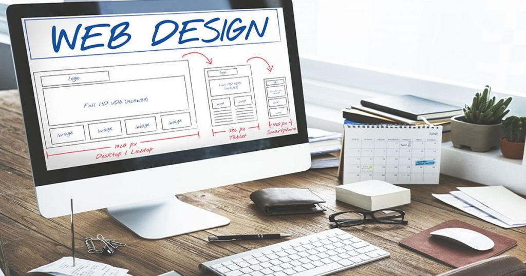
4. Layout
How you decide to arrange your content will have a dramatic impact on both the usability and functionality of your site. There are no specific rules to follow when choosing a layout, however, there are a few main principles to keep in mind. Make sure to consider the needs of your target audience and avoid using an overstimulating layout that might detract from the messages you want to convey.
5. Shapes
The use of graphic elements in web design can help seamlessly integrate text and images, and help with the site’s overall appearance. Combining beautiful colors and shapes can help direct the attention of your sites visitors and contribute to your site’s overall flow.
6. Spacing
Spacing is a key element to creating visually pleasing and easy to navigate websites. Every element in your design will incorporate spacing in one way or another. Appropriate use of whitespace is crucial in creating a design that perfectly balances text, photos, and graphics. Keeping your spacing consistent can help your users navigate your website with ease. The concept of whitespace is definitely a priority of modern web designers.
7. Images & Icons
Amazing designs can communicate a lot of information in just a few seconds. This is made possible with the use of powerful images and icons. Choose images and icons that support and strengthen your message. A quick Google search for stock images and icons will generate thousands of options.
8. Videos
Integrating videos into web design is becoming increasingly popular amongst designers. When used properly, videos can help your users experience or understand a message that can’t be properly conveyed through text or image. Keep in mind that like having a TV screen on in a restaurant, visitors’ eyes will be drawn to moving images. Make sure your videos don’t compete with or detract from other important elements.
Functional Elements
These functional elements are imperative to consider when designing your website. A website that functions properly is crucial for ranking highly on search engines, and giving your users the best possible experience.
1. Navigation
Your website’s navigation is one of the main elements that determines whether your website is functioning properly. Depending on your audience, your navigation can serve multiple purposes: helping first time visitors discover what your site has to offer, giving easy access to your pages for returning visitors, and improving every visitor’s overall experience.
2 User Interactions
Your site visitors have multiple ways of interacting with your site depending on their device (scrolling, clicking, typing, etc.). The best website designs simplify these interactions to give the user the sense that they are in control. Here are a few examples:
- Never auto-play audio or videos
Never underline text unless its clickable - Make sure all forms are mobile-friendly
- Avoid pop ups
- Avoid scroll-jacking
3. Animations
There are tons of web animation techniques that can help your design grab visitor’s attention, and allow your visitors to interact with your site by giving feedback. For example, adding “like” buttons or forms can keep your site’s visitors engaged. If you’re new to web design, we’d recommend keeping your animations simple to avoid developer intervention.
4. Speed
No one likes a slow website. Having to wait more than a few seconds for a page to load can quickly deter a visitor from remaining on or returning to your site. Regardless of how beautiful, if your site doesn’t load quickly, it will not perform well in search (i.e. won’t rank high on Google).
Top site builders typically compress your content for faster load times, however, there are no guarantees. Make sure to research which site builders will work best for the content you will have on your site. For example, PageCloud optimizes your images to ensure fast loading times for sites with large and/or multiple photos.
5. Site Structure
A website’s structure plays an important role in both user experience (UX) and search engine optimization (SEO). Your users should be able to easily navigate through your website without encountering any structural issues. If users are getting lost while attempting to navigate through your site, chances are “crawlers” are too. A crawler (or bot) is an automated program that searches through your website and can determine its functionality. Poor navigation can lead to a poor user experience and site ranking.
6. Cross-browser & Cross-device Compatibility
A great design should look polished on all devices and browsers (yes, even Internet Explorer). If you’re building your site from scratch, we’d recommend using a cross-browser testing tool to make this tedious process faster and more efficient. On the other hand, if you’re using a website building platform, the cross-browser testing is typically taken care of by the company’s development team allowing you to focus on design.
Adaptive Website Design vs. Responsive Website Design
Understanding the pros and cons of adaptive and responsive websites will help you determine which website builder will work best for your website design needs.
You might come across articles online that talk about a whole bunch of different website design styles (fixed, static, fluid, etc.). However, in today’s mobile-centric world, there are only two website styles to use to properly design a website: adaptive and responsive.
Adaptive Websites
Adaptive website design uses two or more versions of a website that are customized for specific screen sizes. They can be split into two main categories based upon how the site detects what size needs to be displayed:
- Adapts based on device type
- Adapts based on browser width
Pros
- WYSIWYG editing (what you see is what you get)
- Custom designs are faster and easier to build without code
- Cross-browser and cross-device compatibility
- Fast-loading pages
Cons
- Websites that use “device-type” can look broken when viewed in a smaller browser window on a desktop
- Limitations on certain effects that only responsive sites can accomplish
Responsive Websites
This type of Website design can use flexible grid layouts that are based on the percentage each element takes up in its container: if one element (e.g. a header) is 25% of its container, that element will stay at 25% no matter the change in screen size. Responsive websites can also use breakpoints to create a custom look at every screen size, but unlike adaptive sites that adapt only when they hit a breakpoint, responsive websites are constantly changing according to the screen size.
Pros
- Great experience at every screen size, regardless of the device type
- Responsive website builders are typically rigid which makes the design hard to “break”
- Tons of available templates to start from
Cons
- Requires extensive design and testing to ensure quality (when starting from scratch)
- Without accessing the code, custom designs can be challenging
It’s important to note that website builders can include both adaptive and responsive features.
Read more of our blogs.
Source: https://www.pagecloud.com/

Read more Blogs
Learn more about us. Feel free to contact us.